 langula

Harnisch Kurrent: my great-grandmother’s handwriting as a font
A small notebook of home remedies, written in Kurrent, survived two world wars in my great-grandmother’s handbag. I rebuilt her handwriting as the font Harnisch Kurrent. Try it here and download it for free.
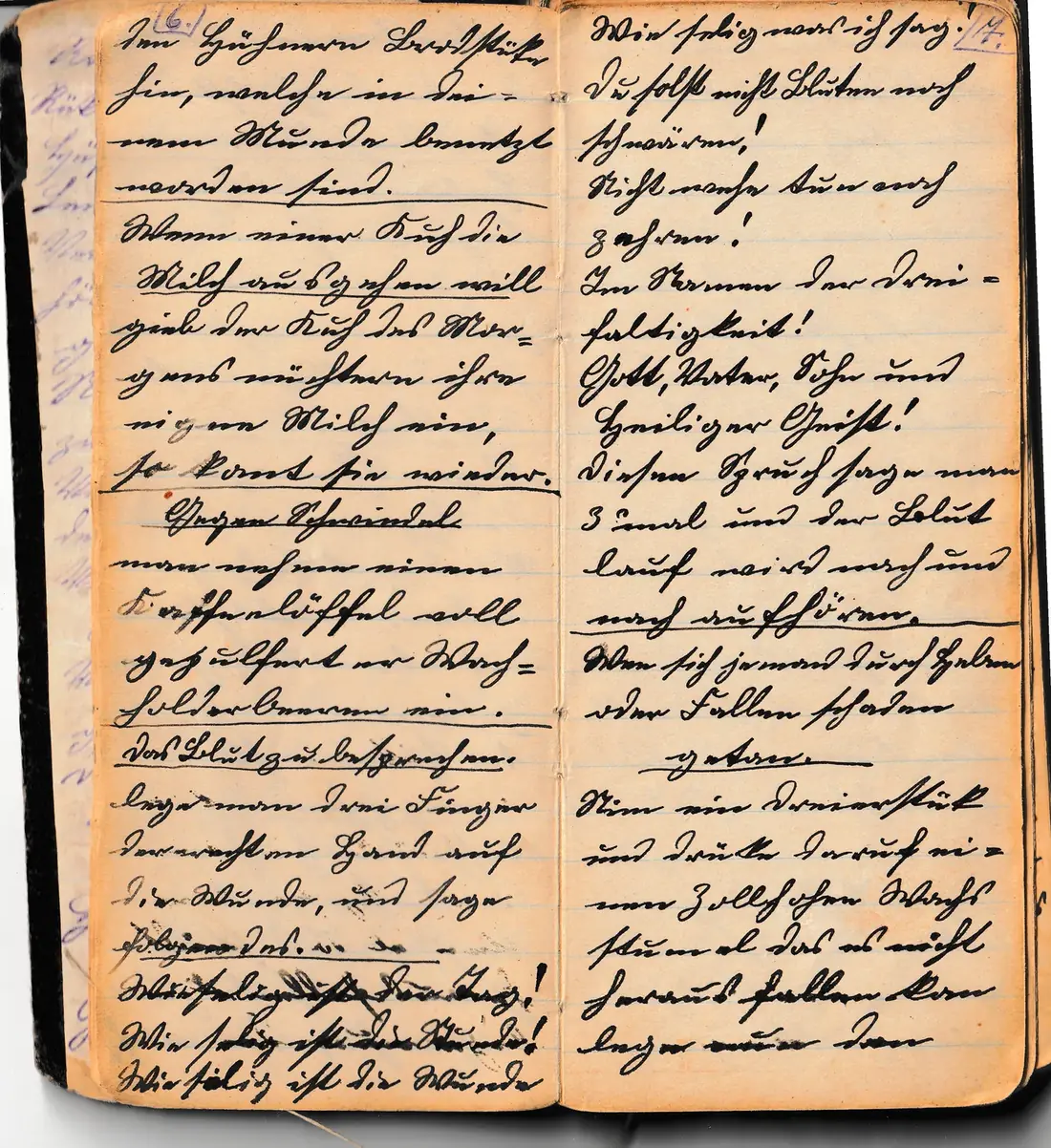
A notebook from a handbag
My great-grandmother always kept this notebook with her. It sat in her handbag, between her identity papers and birth certificates, the things you grab first in an emergency. That is how it came through the First and the Second World War.
After her, my grandmother kept the bag in her wardrobe for decades, then my mother. When my father died in 2023, my mother started sorting and recording old photos and keepsakes for us children. While I was helping her with the family tree, I came across the notebook, together with other old documents.
I knew at once that this was a family treasure. I wanted to preserve it before the paper crumbles any further, and I wanted to share it. Langula is a website about languages, and to me the old German script belongs there. So I scanned every page and rebuilt my great-grandmother’s handwriting as a font anyone can write with.
Thomas Harnisch, founder of Langula
What the notebook says
Almost 70 closely written pages of remedies for erysipelas, coughs and back pain, plus healing charms. At the front a table of contents in violet ink, and she numbered every page herself.
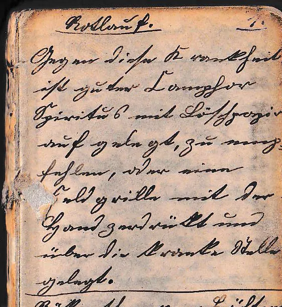
Rotlauf (erysipelas)
„Rotlauf. Gegen diese Krankheit ist guter Camphor-Spiritus, mit Löschpapier aufgelegt, zu empfehlen, oder eine Feldgrille mit der Hand zerdrückt und über die kranke Stelle gelegt.“
“For this illness, good camphor spirit applied with blotting paper is recommended, or a field cricket crushed by hand and laid on the sore spot.”
Rotlauf was the old German word for erysipelas, a skin infection. Camphor spirit was a common home remedy; the cricket belongs to folk belief.
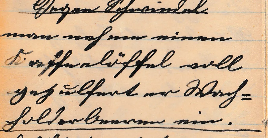
Gegen Schwindel (against dizziness)
„Gegen Schwindel: man nehme einen Kaffeelöffel voll gepulferter Wachholderbeeren ein.“
“Against dizziness: take a teaspoonful of powdered juniper berries.”
The spelling is hers: “gepulfert” instead of “gepulvert” (powdered), and “Wachholder” (juniper) with ch, as it was often written then.
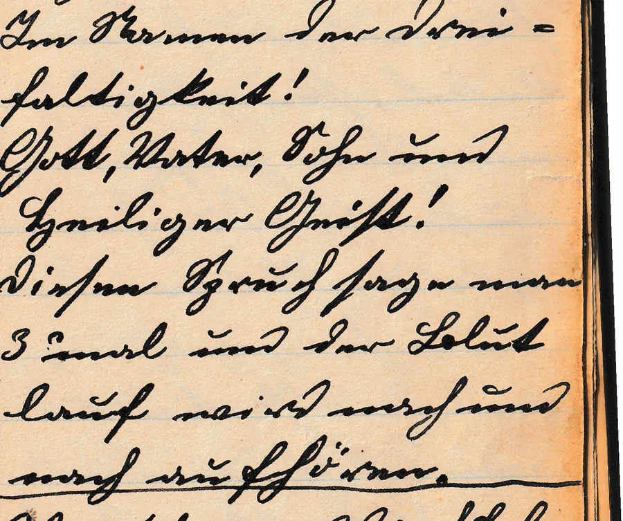
Das Blut zu besprechen (a charm to stop bleeding)
„Im Namen der Dreifaltigkeit! Gott, Vater, Sohn und Heiliger Geist! Diesen Spruch sage man 3 mal und der Blutlauf wird nach und nach aufhören.“
“In the name of the Trinity! God, Father, Son and Holy Spirit! Say this charm 3 times and the bleeding will gradually stop.”
Charms like this were called Besprechungen, “speaking over” a wound. They were passed on by word of mouth and in notebooks like this one.
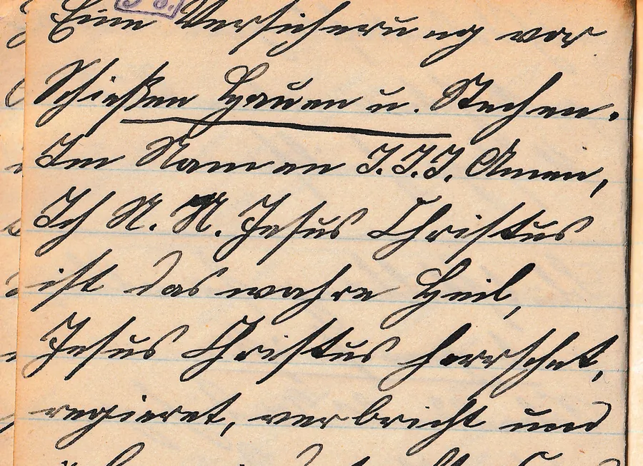
Eine Versicherung vor Schießen, Hauen u. Stechen
“A safeguard against shooting, slashing and stabbing”: a protective charm that calls on Jesus Christ and lists where he should protect its bearer, “on water and land, on mountain and in valley, in house and yard”. Charms like this were copied out and carried on the body.
The remedies and charms show how people tried to help themselves back then. Please don’t try them: if you are unwell, see a doctor.

From notebook to font
Harnisch Kurrent is not a tracing of her handwriting but a rebuild modelled on it: her letter shapes, her slant, her joins.
Scanned
Every double page scanned at 600 dpi, straightened and sorted by the page numbers she wrote in herself.
Measured
The lowercase letters in the notebook are barely one millimetre high. I measured the slant, width, ascenders, descenders and joins in her words.
Redrawn
Tracing was impossible: at that size and so tightly joined, it would have produced nothing but blots. So every letter was redrawn as a pen stroke, with round turns and strong downstrokes like hers.
Joined
As with a dip pen, each letter starts where the previous one ends. After o, b, v and w the next letter starts at the top. The font sets the long ſ inside words by itself.
Compared
Finally I compared it letter by letter with the notebook and corrected it. The capitals follow her own forms, for example S, W and M in “Salz”, “Wasser” and “Man”, D, G and K in “Dazu”, “Gegen” and “Kalmus”, H in “Heiliger” and B in “Blut”. Letters that never appear in the notebook, such as X, follow the usual Kurrent form.
man nehme einen Kaffeelöffel voll gepulferter Wachholderbeeren ein.
Write your text in Harnisch Kurrent
Type your text and save it as an image or PDF, for invitations, labels, a family tree chart or a recipe in the old style.
Tip: type an ancestor's name to see how it looks in the old script, then look for that shape in the record. If an s comes out wrong, type ſ or s in the word yourself; words that already contain an ſ stay as they are.
Free download
Harnisch Kurrent is free, including for commercial projects. The font is licensed under Creative Commons Attribution 4.0 (CC BY 4.0). The one condition: credit the source with a link to this page.
As text (imprint, credits, back cover):
Font “Harnisch Kurrent” by Langula – https://langula.app/en/old-german-script/harnisch-kurrent/As a link for websites:
<a href="https://langula.app/en/old-german-script/harnisch-kurrent/">Font “Harnisch Kurrent” by Langula</a>Harnisch Kurrent
Lowercase with ä, ö, ü, ß and long ſ, capitals, numbers and punctuation. TTF for Windows and Mac, with licence and instructions in English and German.
Download Harnisch Kurrent (ZIP)To join the letters in Word: Font (Ctrl+D) › Advanced › tick “Use Contextual Alternates”.
The Harnisch Kurrent alphabet
Capitals
Questions about Harnisch Kurrent
- Can I use Harnisch Kurrent for free?
- Yes, for private and commercial use: invitations, labels, cards, websites, videos or logos. Harnisch Kurrent is licensed under CC BY 4.0. The only condition is that you credit the source with a link.
- How do I credit the font?
- Add a line to your imprint, under the image or in the credits, for example: Font “Harnisch Kurrent” by Langula – https://langula.app/en/old-german-script/harnisch-kurrent/. On websites please make it a clickable link; in print the address as text is enough.
- Why don’t the letters join in Word?
- Harnisch Kurrent picks the right letter shape depending on the previous letter. Word needs the OpenType feature “Contextual Alternates” for that: select the text, open the Font dialog (Ctrl+D), go to “Advanced” and tick the box. Pages, LibreOffice, Canva and web browsers usually have it on already.
- Can I write English with it?
- Yes. The font covers the full alphabet, so English text, names and dates work too. It will simply look like 19th-century German handwriting, which is what makes it nice for family history projects.
- Why does the e look like an n?
- Because that is how it looks in Kurrent: the lowercase e is two short strokes joined at the top, the n two strokes joined at the bottom. That is why the u carries a little arc. Harnisch Kurrent stays true to the original here.
- Why is it called Harnisch Kurrent?
- Harnisch is our family name: the font carries the name of the family that passed the notebook down through four generations. Kurrent is the German handwriting my great-grandmother wrote it in.